…Not my hair, which has been going grey for years already, but on the house. I know, completely boring, amirite?! But in truth it looks so crisp against the greenery of our subtropical garden that I can’t really go past it. I’m very taken by this colour from the Dulux colour palette:
Or this one:

Or even Lexicon:

If I put Lexicon against Lexicon Quarter I get a really nice subtle difference but it might be too subtle in the bright sun:

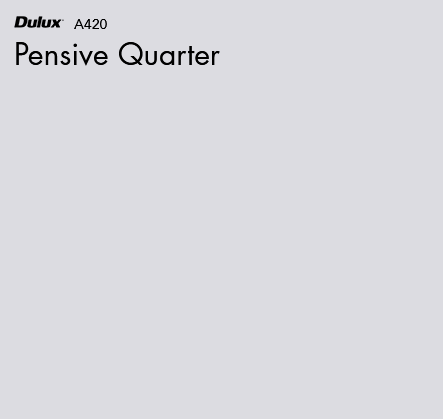
So if I put Lexicon half against purple-based Pensive Quarter it looks lovely:

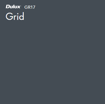
But I prefer it against the Highgate, which is a more subtle colour too – more true grey, which I like. I team it against a lovely bright navy trim for a bit of pop and a cheerful front door, and we’re set. I COULD go dark grey for the trim and that would be fine but it’s just a bit boring – we’re already grey enough! Passionate Blue is gorgeous and gives off just enough of those Greek colour vibes that I really like:

But this would also work well and sits more along the grey spectrum:

Blue trim is a difficult one to decide as it’s only a small pop of colour and can simultaneously look too dark or bright. Normally everything looks lighter outside and darker inside but with trim it can actually be the reverse, as there’s not enough colour to provide much detail. It also has to not clash with our walkway colour, which will be a dark grey.
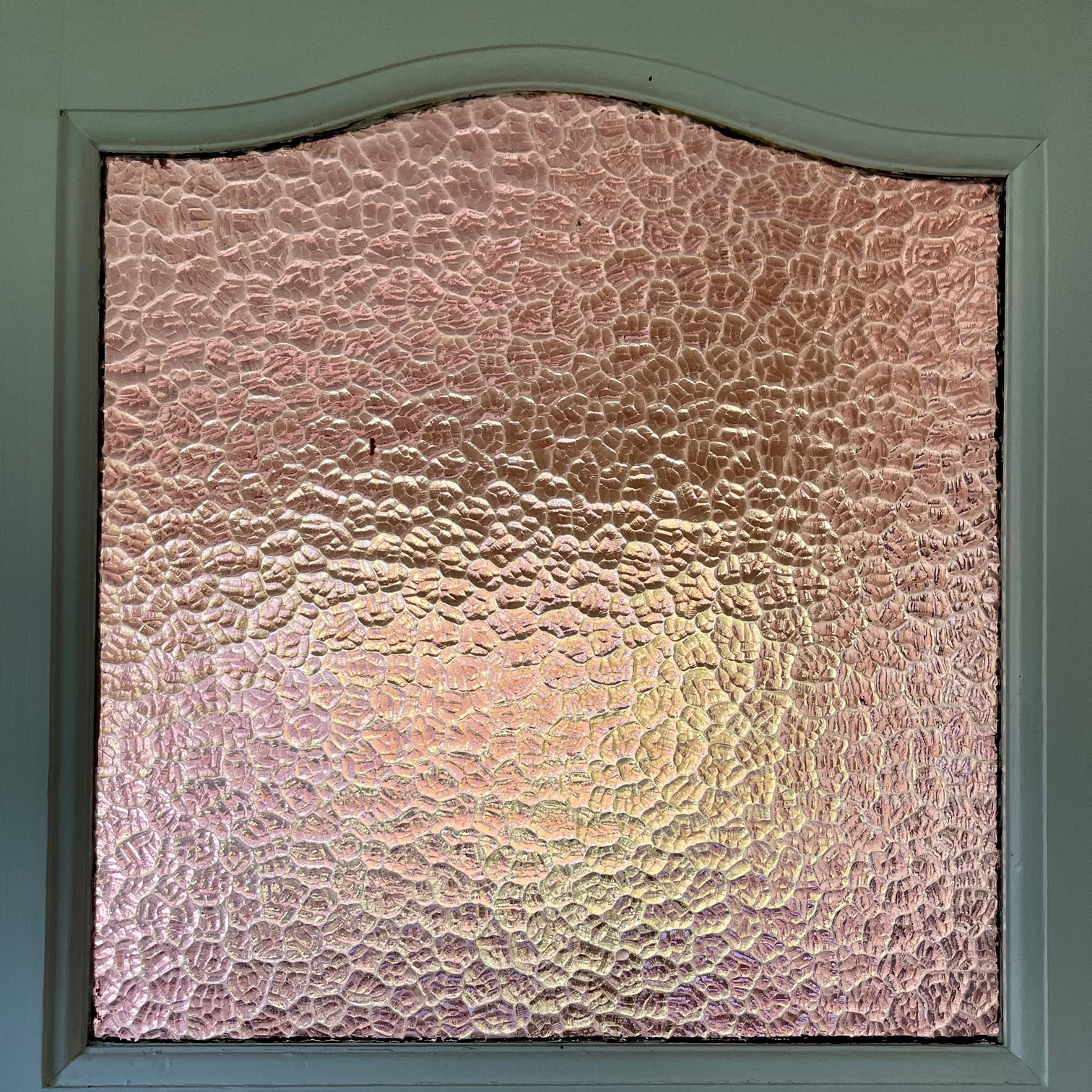
Our front door has this crazy lilac glass inset that we may as well highlight because CUTE, but the colour changes dramatically depending on the light. I took these 3 images within 2 minutes of each other. the first is the interior view and the 2 following are exterior at different angles and light sources:


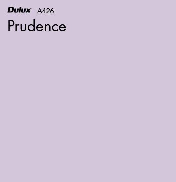
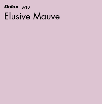
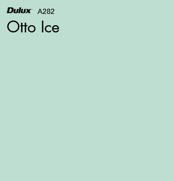
We could go a cute mint green, or lilac such as these pretty shades below:


Any of these would look fabulous against the grey siding, white timber trim and navy highlights. The painter I’m using (we’ve employed them before and they’re Dulux specialists and very good) has also recommended painting the window hoods silver, which would be good as they would then match the corrugated tin roof, and finally painting the front porch and gantry decking a neutral dark grey (we could replace the decking but it’s much cheaper to paint):

You can see that while a lovely combination, this blue would look too similar against the grey:
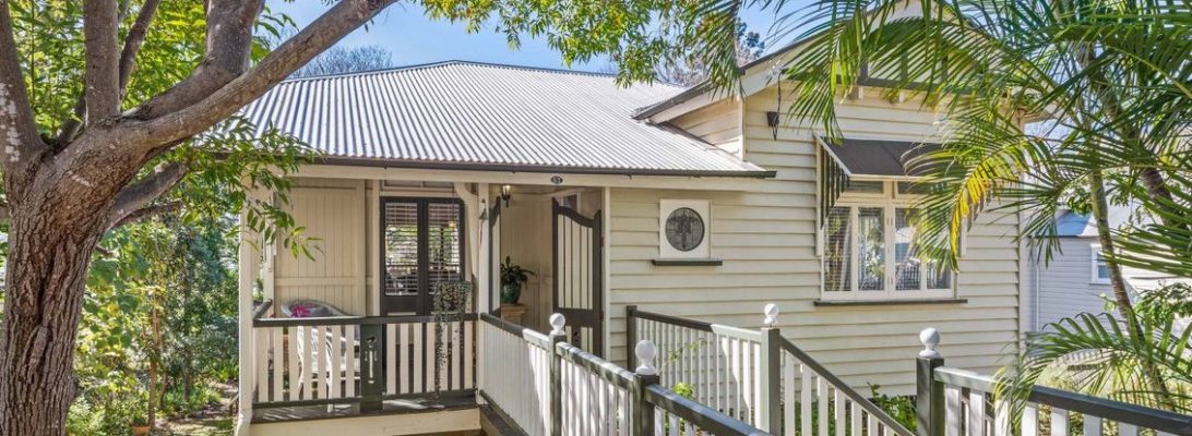
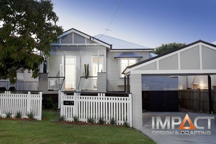
Here’s some houses taken from the web that I thought were lovely inspirations for our paint job:

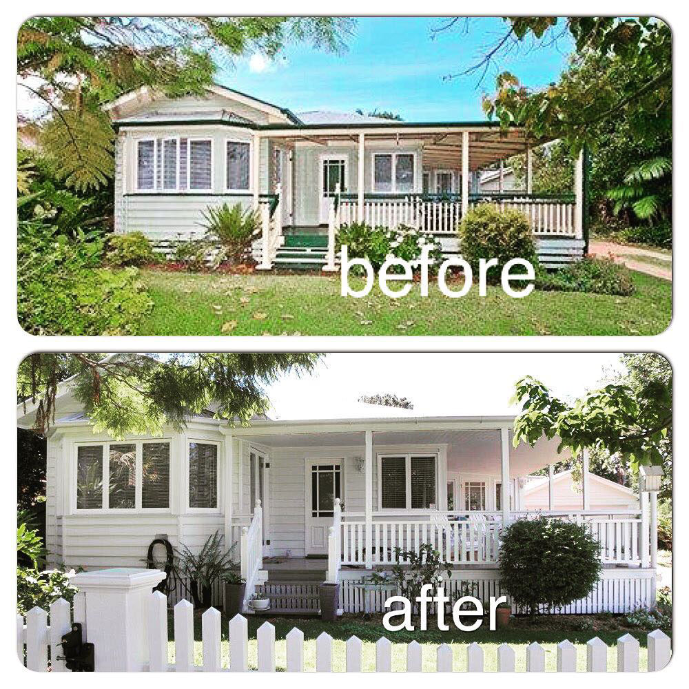
You can see what a difference a well chosen coat of paint makes:

I really am going for the palest of pale greys though:


So there you have it: my colour ideas for our house! Hopefully this can be achieved this year!

